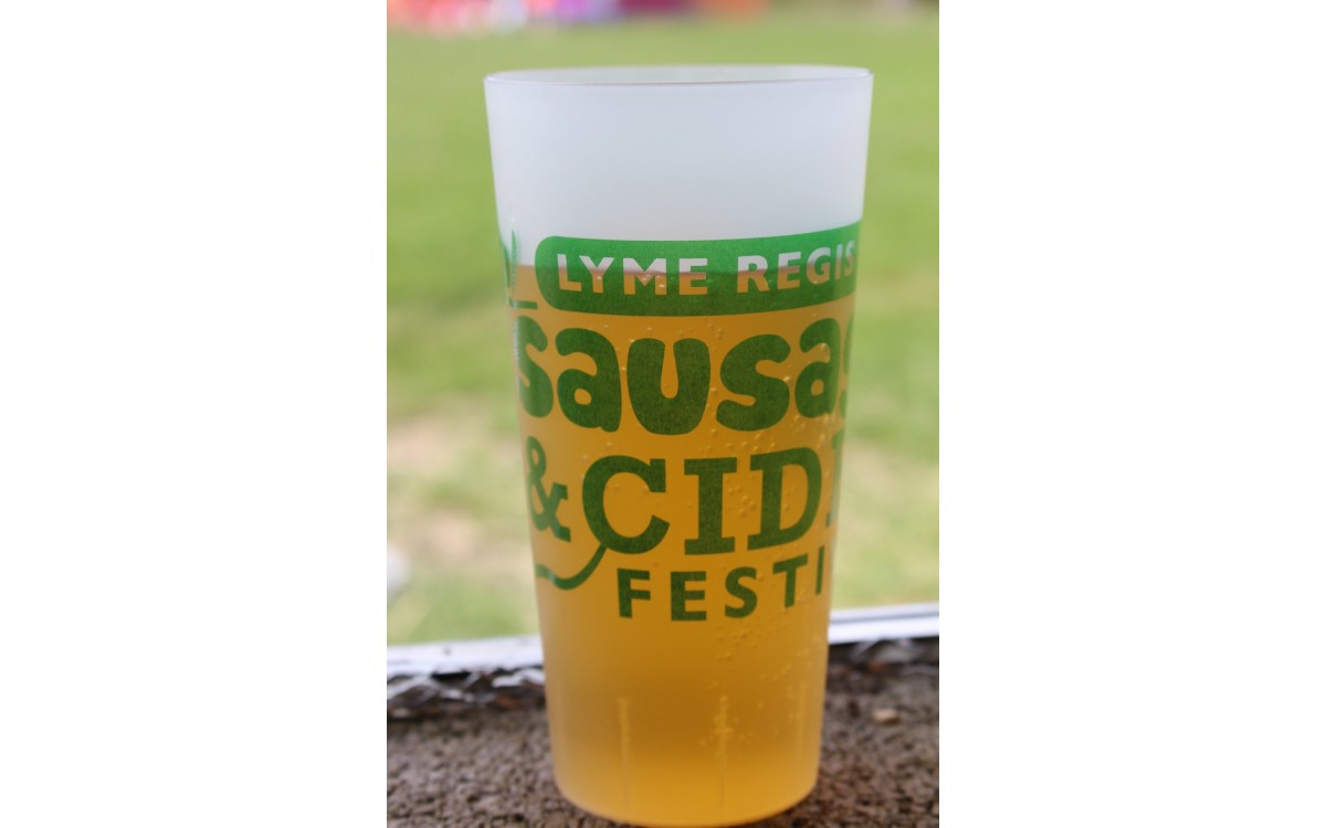
As you might expect a company that specialises in the provision of custom printed festival cups to say, the visual dimension of your event is an absolutely integral one.
The artwork that you rustle up for your festival promotion, for instance, won’t just be going on your branded festival cups. That’s because it’ll also need to be splashed across the official website, posters and flyers that will be crucial to your efforts to attract people to turn up to your event in the first place.
Now, of course, we could never simply tell you how to create the artwork for your festival, so we won’t do that. Instead, we’ll give you a few tips that will hopefully help you to come up with a firmer overall direction for the aesthetic of your upcoming event’s marketing.
Consider whether you want a typographic, photographic or illustrative look
If you glance at any festival poster, the likelihood is that you’ll be able to broadly place it into one of the aforementioned three categories.
As for the one that best suits your festival, that’s likely to depend on the specific vibe that you aspire to for the event.
A photographic aesthetic is often a great match to a pop or rock festival, for example, while if you are organising an event that exudes a sense of ‘high art’ – let’s say, a jazz, alternative music or even food festival – a more illustrative or abstract approach might be wiser.
Cultivate a certain ambience and mood through colour
There are a lot of potential starting points for working through ideas for your festival’s promotional imagery – such as experimentations with graphics or typography.
It’s actually colour, though, that will probably have the most profound impact on your event artwork, in terms of the atmosphere and mood that is set.
Oranges and yellows may be great for evoking the atmosphere of summertime events, as many festivals are, but if you want to get a sense of night-time glamour in your event’s imagery, you might instead opt to place neon illustrative elements against a dark background.
Aim for an obvious focal point
Most of the truly iconic festival and event flyers and posters do tend to have a clear point of focus for the viewer’s eyes to settle on. You might have a close-up of a distinctive element such as someone’s eyes or face, or you could use a silhouette of a performer on a concert stage.
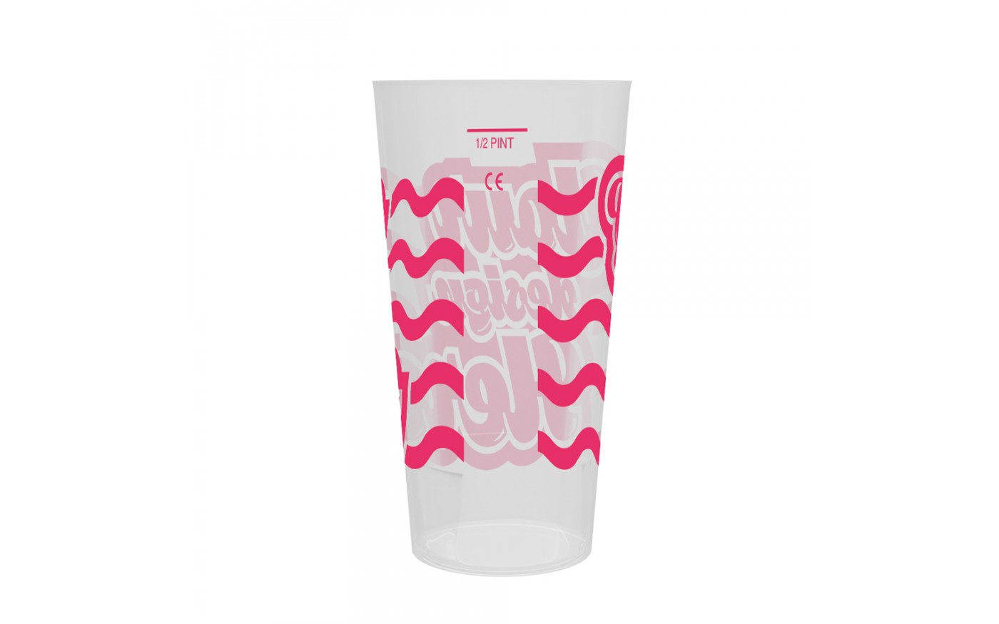
As with all of the tips we’ve outlined in this article, though, it’s a good idea when you’re trying out different compositional elements, to consider how the given design would look on your festival cups – provided that you’re using broadly the same design as will be appearing on your posters and website.
There’s much more that we could tell you about creating a captivating visual identity for your festival, but we should probably point out at this point that our main focus is festival cups, rather than your event’s entire art direction!
So, we’d suggest that you get in touch with our team today for answers to any of your queries
about the more technical aspects of making your ultimate design work well with
the festival cups you choose from the options in our online store. From
everyone here at Branded Cups, we wish you the very best of luck with your
2020s festival!